Random finds (2018, week 11) — On the limits of conventional thinking, ‘fuzhipin’ and the difference between original and copy, and ‘porphureos’ and our perception of colour

“I have gathered a posy of other men’s flowers, and nothing but the thread that binds them is mine own.” — Michel de Montaigne
Random finds is a weekly curation of my tweets and, as such, a reflection of my curiosity.
The limits of conventional thinking (in less than 4 minutes)
“For years, ‘milers’ had been striving against the clock, but the elusive four minutes had always beaten them. It had become as much a psychological barrier as a physical one. And like an unconquerable mountain, the closer it was approached, the more daunting it seemed,” the British journalist and runner John Bryant wrote in 3:59.4: The Quest to Break the 4 Minute Mile.
Bryant’s book goes beyond the classic story of Roger Bannister, who, on May 6, 1954, busted through the four-minute barrier with a time of three minutes, fifty-nine and four-tenths of a second. According to Bill Taylor in an article for Harvard Business Review, it holds important lessons for leaders who want to bust through barriers in their fields.
“When Bannister broke the mark, even his most ardent rivals breathed a sigh of relief. ‘At last, somebody did it!’ And once they saw it could be done, they did it too. Just 46 days Bannister’s feat, John Landy, an Australian runner, not only broke the barrier again, with a time of 3 minutes 58 seconds. Then, just a year later, three runners broke the four-minute barrier in a single race. Over the last half century, more than a thousand runners have conquered a barrier that had once been considered hopelessly out of reach.”

Also in business, progress does not move in straight lines, Tayler notes.
“Whether it’s an executive, an entrepreneur, or a technologist, some innovator changes the game, and that which was thought to be unreachable becomes a benchmark, something for others to shoot for. That’s Roger Bannister’s true legacy and lesson for all of us who see the role of leadership as doing things that haven’t been done before.”
In The Power of Impossible Thinking, Yoram Wind and Colin Crook, the two Wharton School professors who have analyzed the lessons for business of the four-minute mile, emphasize the mindset behind Bannister’s breakthrough rather than his physical achievement.
“How is it, they wonder, that so many runners smashed the four-minute barrier after Bannister became the first to do it? ‘Was there a sudden growth spurt in human evolution? Was there a genetic engineering experiment that created a new race of super runners? No. What changed was the mental model. The runners of the past had been held back by a mindset that said they could not surpass the four-minute mile. When that limit was broken, the others saw that they could do something they had previously thought impossible,’” Taylor writes.
In business, thinking about strategy, competition, and leadership emphasizes the intricacies of business models — revenues, costs, niches, leverage. But it is actually mental models that allow organizations and their leaders “to try not just to be the best at what everyone else can do, but to do things that only they can do — which, over time, shows others what it possible.”
Great leaders don’t accept the limitations, tradeoffs and middle-of-the-road sensibilities that define conventional wisdom. They don’t merely out-perform their rivals; they transform the sense of what’s possible in their fields. “That’s what makes icons like Roger Bannister so unforgettable — and so important.”
‘Fuzhipin’ and the difference between original and copy
The Chinese have two different concepts of a copy, says Byung-Chul Han, a professor of philosophy and cultural studies at the Berlin University of the Arts, in The copy is the original.
“‘Fangzhipin’ (仿製品) are imitations where the difference from the original is obvious. These are small models or copies that can be purchased in a museum shop, for example. The second concept for a copy is ‘fuzhipin’ (複製品). They are exact reproductions of the original, which, for the Chinese, are of equal value to the original. It has absolutely no negative connotations.”
This difference has often led to misunderstandings and arguments between China and Western museums. “The Chinese often send copies abroad instead of originals, in the firm belief that they are not essentially different from the originals. The rejection that then comes from the Western museums is perceived by the Chinese as an insult,” Han writes.
One example is the decision by the director of the Museum of Ethnology in Hamburg to close the 2007-exhibition of terracotta warriors when it became known that the statues flown in from China weren’t 2,000-year-old artefacts, but rather copies. In a statement, the director said there was “no other option than to close the exhibition completely, in order to maintain the museum’s good reputation.’” German art critics even went so far to call it the “art crime of the decade,” saying that exhibition-goers have been conned in what could be one of the biggest copyright infringement cases Germany has ever known.
In China, however, the production of replicas proceeded in parallel with the excavations. “A replica workshop was set up on the excavation site itself. But they were not producing ‘forgeries.’ Rather, […] the Chinese were trying to restart production, as it were — production that from the beginning was not creation but already reproduction. Indeed, the originals themselves were manufactured through serial mass-production using modules or components — a process that could easily have been continued, if the original production methods had been available.”

This raises the question what is an original and what is a copy?
“Instead of a difference between original and copy, there appears a difference between old and new. We could even say that the copy is more original than the original, or the copy is closer to the original than the original, for the older the building becomes, the further it is from its original state. A reproduction would restore it, as it were, to its ‘original state,’ especially since it isn’t linked to a particular artist,” Han writes.
“In the West, when monuments are restored, old traces are often particularly highlighted. Original elements are treated like relics,” Han continues. In the Far East, people are unfamiliar with the Western cult of the original. Instead, they have developed a different technique of preservation that might be more effective than conservation or restoration. “This takes place through continual reproduction. This technique completely abolishes the difference between original and replica. We might also say that originals preserve themselves through copies. Nature provides the model. The organism also renews itself through continual cell-replacement. After a certain period of time, the organism is a replica of itself. The old cells are simply replaced by new cell material. In this case, the question of an original does not arise. The old dies off and is replaced by the new. Identity and renewal are not mutually exclusive. In a culture where continual reproduction represents a technique for conservation and preservation, replicas are anything but mere copies.”
“The original is something imaginary. It is in principle possible to build an exact copy, a ‘fuzhipin’ of Freiburg Minster, in one of China’s many theme parks. Is this then a copy or an original? What makes it a mere copy? What characterises the Freiburg Minster as an original? Materially, its ‘fuzhipin’ might not differ in any way from the original that itself might someday no longer contain any original parts. It would be, if at all, the place and the cult value related to the practice of worship that might differentiate the Freiburg Minster from its ‘fuzhipin’ in a Chinese theme park. However, remove its cult value completely in favour of its exhibition value, and its difference from its double might disappear, too.”
‘Porphureos’ and our perception of colour
“Steve Jobs’s revolution in commercial aesthetics would have been impossible without another one that occurred 35 years earlier,” writes Bruce Falconer in What Is the Perfect Color Worth?, in which he looks “inside the mysterious art — and big business — of color forecasting.”
“A nagging problem had troubled the color industry from its inception: how to communicate accurately the subtleties of perception. In his 1963 book, Interaction of Color, the Bauhaus artist and Yale professor Josef Albers wrote: ‘If one says ‘Red’ (the name of a color) and there are 50 people listening, it can be expected that there will be 50 reds in their minds. And one can be sure that all these reds will be very different.’ There are innumerable colors, he continued, but only about 30 names for them. And even if you could describe all of those colors, wouldn’t your sense of them still differ from someone else’s? As the British journalist Kassia St Clair writes in The Secret Lives of Color, “You could no more meaningfully secure a precise universal definition for all the known shades than you could plot the coordinates of a dream.’”
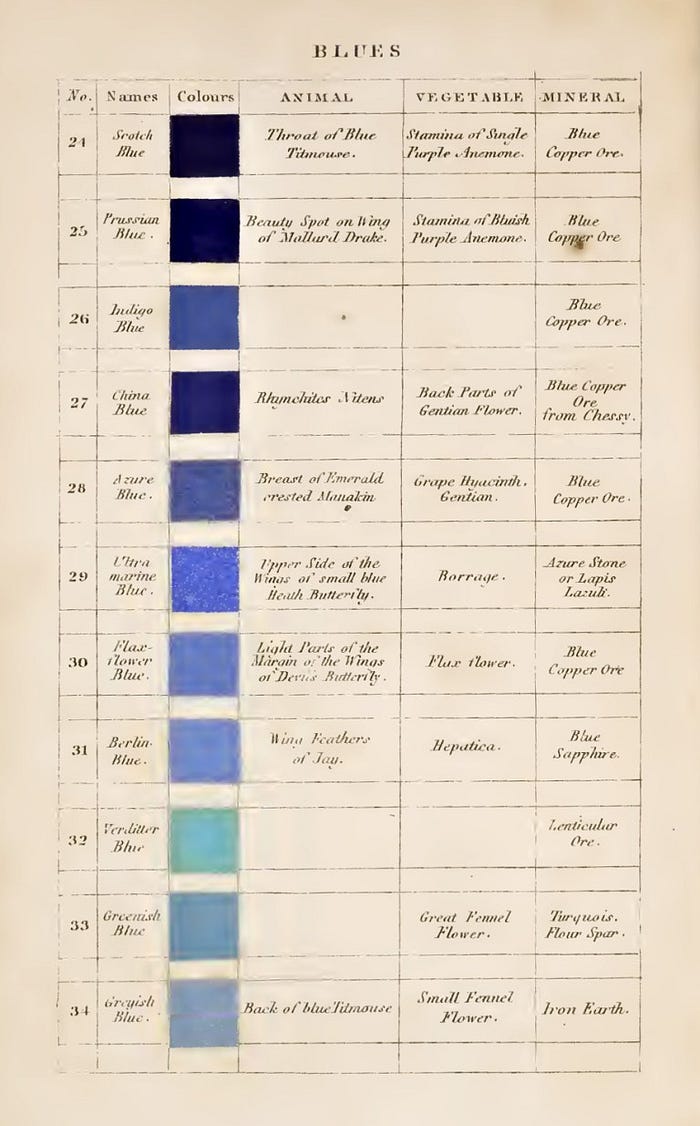
“The idea that colors exert powerful, often subliminal forces on the human mind is at once [Leatrice] Eiseman’s [the executive director of the Pantone Color Institute, and, as one of her European associates put it, “Ms. Color in America”] ardent belief and her professional stock in trade. As she wrote 18 years ago in Pantone Guide to Communicating With Color, ‘some experts believe that humans have an ancient wisdom, that throughout eons of evolutionary history going back to the beginning of time, we have an associative memory concerning space, form, patterns and colors.’ Leveraging that wisdom and revealing the unspoken meanings and emotions conveyed by slight, almost imperceptible variations in color has been her life’s work,” Falconer writes.
“Eiseman believes that our reaction to colors ‘goes beyond the psychological into the physiological’ and that colors carry inherent messages that all humans innately understand — the whispers of that ‘ancient wisdom.’ She doesn’t deny the important influence of memory and social factors on color perception, but often, she says, ‘our response is involuntary, and we simply have no control over it.’ As evidence, she points to word-association tests she has administered over the years during her work with Pantone. I asked to see a sample test and some results, but Eiseman refused and said they were proprietary. You can get a feel for her methods, though, from [How Pantone Colors Your World, a 2015 interview she gave to Nautilus and which was published in Issue 026, Color — Beyond the spectrum]. ‘You take a Pantone color chip and you ask, Give us the first word that pops into your mind when you look at this color, and you see whether that corresponds to a positive, negative or indifferent response,’ Eiseman said. ‘If you show people a chip of Pantone Sky Blue, about 90 percent or more will respond in the same way: It’s the color of the sky, it’s bright, it’s a light color, it reminds you of that openness. It’s a near-universal response that you get.’”

Eiseman 10th and most recent book, The Complete Color Harmony, Pantone Edition, “offers a kind of chromatic horoscope that locates truths not in the cosmos but in the spectrum of visible light,” Falconer writes. “Take blue […]. ‘Blue people aspire to harmony, serenity, patience, perseverance and peace, and have a calming influence on other people,’ [Eiseman] writes. ‘You are generally unflappable, even-tempered and reliable, a team player and good co-worker.’”
If you don’t like blue, perhaps you may want to change your job, a relationship or even your life, and long for more excitement, Eiseman suggests. “And the fortunetelling continues,” Falconer writes.
“The flip tone of these pronouncements, combined with the lack of any grounding in scientific rigor or research apart from Eiseman’s own observations, may tempt you to dismiss color psychology altogether, consigning it to the bin with other junk sciences, like phrenology or cold fusion. But a great many people take it seriously — so many, in fact, that for all my searching, I found only one person willing to question it. When I put Eiseman’s assertions to David Comberg, a senior lecturer of design at the University of Pennsylvania, he scoffed and said that color preferences are highly subjective, unpredictable and, in his experience, ‘primarily influenced by culture and emotion and are not easily quantified.’ When we see red, for instance, are we reacting to the color itself or to a personal experience, perhaps buried in the subconscious, that we associate with it? ‘And what about taste, smell and sound? Artificial intelligence and neuroscience may one day answer all this, but I’m not sure,’ Comberg said. ‘It all seems subjective and irrational.’”

“But among people in Eiseman’s profession, as with the hordes of credulous color enthusiasts who populate the internet, her views are not only uncontroversial but well within the mainstream. ‘We are born to understand that green equals calming, because it’s found in nature; red equals danger, because it’s the color of blood,’ Jenny Ross, a creative- design manager in the footwear department at New Balance, told me. ‘Yellow equals energy, because it’s the color of the sun.’ WGSN’s Jane Monnington Boddy agreed, saying, ‘People do have an inbuilt, preprogrammed understanding of colors, as animals do in nature.’ What else explains our instinct to recoil from red-and-black snakes, she asked, or from yellow-and-black flying insects?”
Ultimately, though, color psychology may matter less to Pantone’s success than something much less mysterious, says Falconer.
“At a certain point, Pantone’s prognostications began to take on the weight of self-fulfilling prophecies. Much like investors who base financial decisions on the assessments of Moody’s and Standard & Poor’s, Pantone’s clientele seems to understand that, for all the time and effort the company expends in identifying color trends, it’s the judgments themselves, regardless of the research behind them, that matter most.”
According to Mazviita Chirimuuta, “Philosophers have a bad reputation for casting unwarranted doubt on established facts. Little could be more certain than your belief that the cloudless sky, on a summer afternoon, is blue.”
“Yet we may wonder in earnest, is it also blue for the birds who fly up there, who have different eyes from ours? And if you take an object that shares that color — like the flag of the United Nations — and place half in shadow and half in the full sun, one side will be a darker blue. You might ask, what is the real color of the flag? The appearances of colors are frequently changing with the light, and as we move objects surrounding them. Does that mean that the actual colors change?, she wonders in The Reality of Color Is Perception.
But despite first appearances, colors are subjective and transitory. “Color is one of the longstanding puzzles in philosophy, raising doubts about the truthfulness of our sensory grasp on things, and provoking concerns as to the metaphysical compatibility of scientific, perceptual, and common sense representations of the world. Most philosophers have argued that colors are either real or not real, physical or psychological. The greater challenge is to theorize the subtle way that color stands between our understanding of the physical and the psychological.”
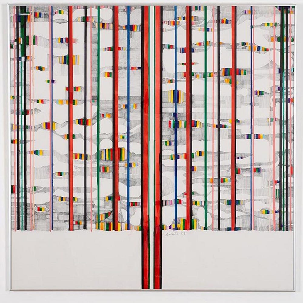
Chirimuuta’s “response is to say that colors are not properties of objects (like the U.N. flag) or atmospheres (like the sky) but of perceptual processes — interactions which involve psychological subjects and physical objects.” In her view, “colors are not properties of things, they are ways that objects appear to us, and at the same time, ways that we perceive certain kinds of objects. This account of color opens up a perspective on the nature of consciousness itself.”
“The problem with these realist and anti-realist proposals is that they each only focus on either the objective or subjective aspects of color. An alternative position can best be described as relationist,’” Chirimuuta writes.
“[C]olors are not properties of minds (visual experiences), objects or lights, but of ‘perceptual processes’ — interactions that involve all three terms. According to this theory, which I call ‘color adverbialism,’ colors are not properties of things, as they first appear. Instead, colors are ways that stimuli appear to certain kinds of individuals, and at the same time, ways that individuals perceive certain kinds of stimuli. The ‘adverbialism’ comes in because colors are said to be properties of processes rather than things. So instead of treating color words as adjectives (which describe things), we should treat them as adverbs (which describe activities). I eat hurriedly, walk gracelessly, and on a fine day I see the sky bluely!”
“The Greek colour experience was made of movement and shimmer. Can we ever glimpse what they saw when gazing out to sea?,” Maria Michela Sassi, a professor of ancient philosophy at Pisa University, wonders in The sea was never blue.
“How differently the Greeks must have viewed their natural world, since their eyes were blind to blue and green, and they would see instead of the former a deeper brown, and yellow instead of the latter (and for instance they also would use the same word for the colour of dark hair, that of the corn-flower, and that of the southern sea; and again, they would employ exactly the same word for the colour of the greenest plants and of the human skin, of honey and of the yellow resins: so that their greatest painters reproduced the world they lived in only in black, white, red, and yellow),” wrote Friedrich Nietzsche when he tried to capture the strangeness of the Greek colour vocabulary.
Like Nietzsche, also Johann Wolfgang von Goethe observed these features of Greek chromatic vision. “The versatility of xanthos [which covers the most various shades of yellow, from the shining blond hair of the gods, to amber, to the reddish blaze of fire] and chloros [which suggests the colour green but can also itself convey a vivid yellow, like honey] led him to infer a peculiar fluidity of Greek colour vocabulary.”
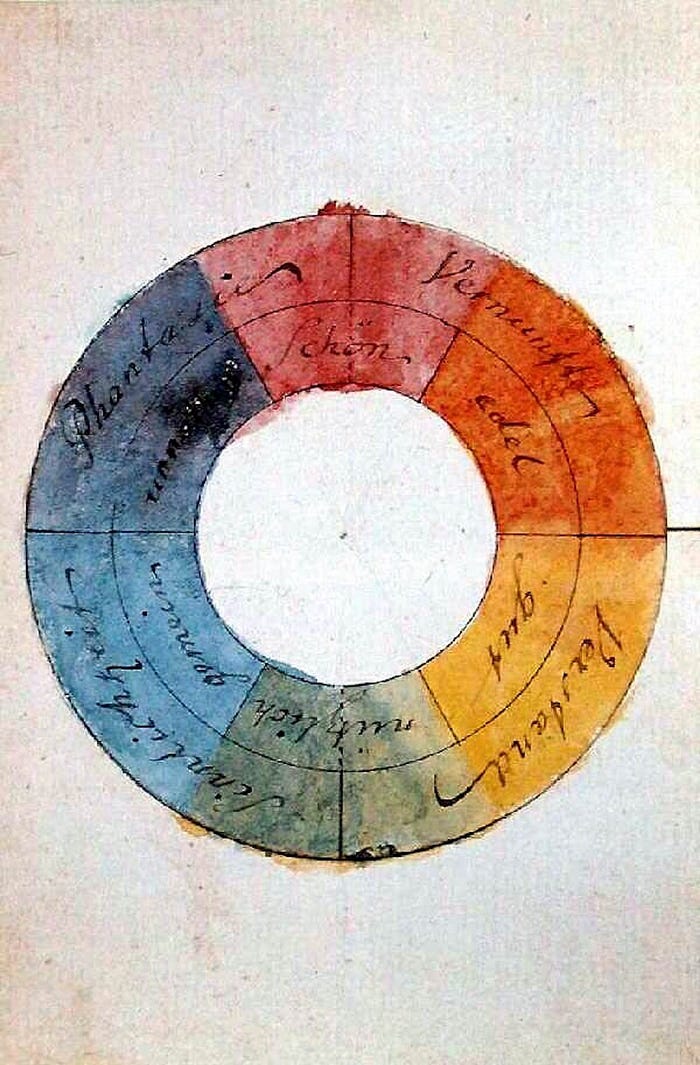
Goethe believed the Greeks weren’t interested in defining the different hues. He underpinned his judgment through a careful examination of the theories on vision and colours elaborated by the Greek philosophers, such as Aristotle and Plato, who attributed an active role to the visual organ, equipped with light coming out of the eye and interacting with daylight so as to generate the complete range of colours, Sassi writes.
“Goethe also noted that ancient colour theorists tended to derive colours from a mixture of black and white, which are placed on the two opposite poles of light and dark, and yet are still called ‘colours’. The ancient conception of black and white as colours — often primary colours — is remarkable when compared with Isaac Newton’s experiments on the decomposition of light by refraction through a prism. The common view today is that white light is colourless and arises from the sum of all the hues of the spectrum, whereas black is its absence.”
Goethe set the Greeks’ approach to colour against Newton’s for their having caught the subjective side of colour perception. He considered the Newtonian theory to be a mathematical abstraction in contrast with the testimony of the eyes, and thus downright absurd. The ancient Greeks already knew, he wrote, that, “If the eye were not Sun-like, it could never see the Sun.”

Today, “thanks to our modern ‘anthropological gaze’ it is accepted that every culture has its own way of naming and categorising colours. This is not due to varying anatomical structures of the human eye, but to the fact that different ocular areas are stimulated, which triggers different emotional responses, all according to different cultural contexts.”
Goethe was indeed right when he wrote that the Greek experience of colours is rather peculiar. “There is a specific Greek chromatic culture, just as there is an Egyptian one, an Indian one, a European one, and the like, each of them being reflected in a vocabulary that has its own peculiarity, and not to be measured only by the scientific meter of the Newtonian paradigm,” Sassi writes. But can we hope to understand how the Greeks saw their world?
“In trying to see the world through Greek eyes, the Newtonian view is only somewhat useful. We need to supplement it with the Greeks’ own colour theories, and to examine the way in which they actually tried to describe their world. Without this, the crucial role of light and brightness in their chromatic vision would be lost, as would any chance to make sense of the mobility and fluidity of their chromatic vocabulary. If we rely only on the mathematical abstractions of Newton’s optics, it is impossible to imagine what the Greeks saw when they stood on their shores, gazing out upon the ‘porphureos’* sea stretching into the distant horizon.”
* — ‘Porphureos’ is probably the most difficult chromatic term to grasp. “Not only does ‘porphureos’ not correspond to any definite hue, placed as it is on the borderline between red and blue (in Newtonian terms), but it is often applied to objects that do not appear straightforwardly ‘purple,’ as in the case of the sea. (The fact that the sea can appear purple at sunset is not sufficient to explain the frequency of this epithet in Greek literature.) When the sea is called ‘porphureos,’ what is described is a mix of brightness and movement, changing according to the light conditions at different hours of the day and with different weather, which was the aspect of the sea that most attracted Greek sensitivity. This is why Homer calls the sea ‘winey,’ which alludes not so much to the wine tint of the water as to the shine of the liquid inside the cups used to drink out of at a symposium. As shown by the naval friezes and the aquatic animals painted inside many drinking vessels, vase painters turned the image around, so that the surface of the drink suggested the waving of the sea. ‘Porphureos’ conveys this combination of brightness and movement — a chromatic term impossible to understand without considering the glimmer effect.”
And also this …
“When the philosopher Karl Popper, writing in Unended Quest, dreamed of his ideal school, he imagined the very opposite, namely a place where learning takes the form of free, intrinsically interesting enquiry, rather than mere exam preparation: ‘If I thought of a future, I dreamt of one day founding a school in which young people could learn without boredom, and would be stimulated to pose problems and discuss them; a school in which no unwanted answers to unasked questions would have to be listened to; in which one did not study for the sake of passing examinations.’”
John Taylor, the director of Learning, Teaching and Innovation at Cranleigh boarding school in Surrey, where he also directs the Philosophy in Education Project, shares Popper’s dream. “I think,” he says, “that school becomes more enjoyable and more effective when, instead of simply teaching students to pass examinations, they teach students to think for themselves.
To understand how this can be achieved, we need to remember something that Socrates drew our attention to long ago, but which in our eagerness to turn schools into engines of economic productivity we have forgotten, namely that education is a philosophical process. It begins with questioning, proceeds by enquiry, and moves in the direction of deeper understanding. The journey of enquiry is powered by critical reflection, discussion and debate. It leads not to final answers but to a greater appreciation of the limits of our knowledge, both of the world around us and of our own mysterious selves.”

“It is this appreciation that Socrates termed ‘wisdom.’ He tried to goad his fellow Athenians into beginning to think for themselves by questioning them so as to expose their limited understanding of ideas that were central to their lives, such as justice or courage. Undertaken in a constructive spirit, Socratic questioning becomes the starting point for a process of enquiry as we seek to expand our understanding. It can also engender humility and openness to the ideas of others.
If schools are to fulfil their purpose, they cannot afford to neglect this philosophical dimension of learning. They need to see themselves not simply as dispensers of the knowledge necessary for success in the world of work but as communities of philosophical reflection, spaces where students can explore the meaning of what they learn, and think for themselves about what it means to live well. Understood in these terms, philosophical education is not a discrete subject but an approach to learning that finds application at all points of the curriculum.”
Are the most successful people in society just the luckiest people?
“What does it take to succeed? What are the secrets of the most successful people? Judging by the popularity of magazines such as Success, Forbes, Inc., and Entrepreneur, there is no shortage of interest in these questions. There is a deep underlying assumption, however, that we can learn from them because it’s their personal characteristics — such as talent, skill, mental toughness, hard work, tenacity, optimism, growth mindset, and emotional intelligence — that got them where they are today. This assumption doesn’t only underlie success magazines, but also how we distribute resources in society, from work opportunities to fame to government grants to public policy decisions. We tend to give out resources to those who have a past history of success, and tend to ignore those who have been unsuccessful, assuming that the most successful are also the most competent,” Scott Barry Kaufman writes in The Role of Luck in Life Success Is Far Greater Than We Realized.
But is this assumption correct?
Kaufman has spent his entire career studying the psychological characteristics that predict achievement and creativity. And while he has found that a certain number of traits — including passion, perseverance, imagination, intellectual curiosity, and openness to experience — do significantly explain differences in success, Kaufman is intrigued by just how much of the variance is often left unexplained.
In an attempt to shed light on this, the Italian physicists Alessandro Pluchino and Andrea Raspisarda teamed up with the Italian economist Alessio Biondo to make the first ever attempt to quantify the role of luck and talent in successful careers.
“The results […], which dovetail with a growing number of studies based on real-world data, strongly suggest that luck and opportunity play an underappreciated role in determining the final level of individual success. As the researchers point out, since rewards and resources are usually given to those who are already highly rewarded, this often causes a lack of opportunities for those who are most talented (i.e., have the greatest potential to actually benefit from the resources), and it doesn’t take into account the important role of luck, which can emerge spontaneously throughout the creative process.
The researchers argue that the following factors are all important in giving people more chances of success: a stimulating environment rich in opportunities, a good education, intensive training, and an efficient strategy for the distribution of funds and resources. They argue that at the macro-level of analysis, any policy that can influence these factors will result in greater collective progress and innovation for society (not to mention immense self-actualization of any particular individual).”
“A sleeping beauty arcs across the bottom of the vast canvas, breasts akimbo, the curve of her gorgeous thighs echoing the arms that are flung in surrender above her head. The colours are curiously cool for a painting with such heat: a dark, dark blue, deep green and, for the body in ecstasy, a curious, marble-like mauve. Pablo Picasso never chose the easy route. ‘I would love to paint like a blind man who pictures an arse by the way it feels,’ he said in the spring of 1932. And so he did. He completed Nude, Green Leaves and Bust in his Paris studio in a single day that March. It is among his most erotic works,” writes Fiammetta Rocco in Picasso’s nudist streak.
“This picture is not just mysterious, but baffling. Blue fabric is draped across the back, held up by four orange buttons. At first glance it looks like a stage backdrop; it could also be a curtain, shutting out the world. The woman seems to be sunk in a dream of post-coital pleasure. Behind her an elevated plaster bust looks on — not down at the naked figure as you might expect — but past an array of rounded, long-stemmed green leaves out to a point beyond the edge of the painting. Look closer: to the left of the bust, embedded in the curtain’s blue folds, is a second profile with lips parted. This face is definitely looking down. Suddenly we are unsure whether the two faces represent the act of looking or of imagining. Is the woman being watched by another or dreaming of herself? The uncertainty is part of the allure.”
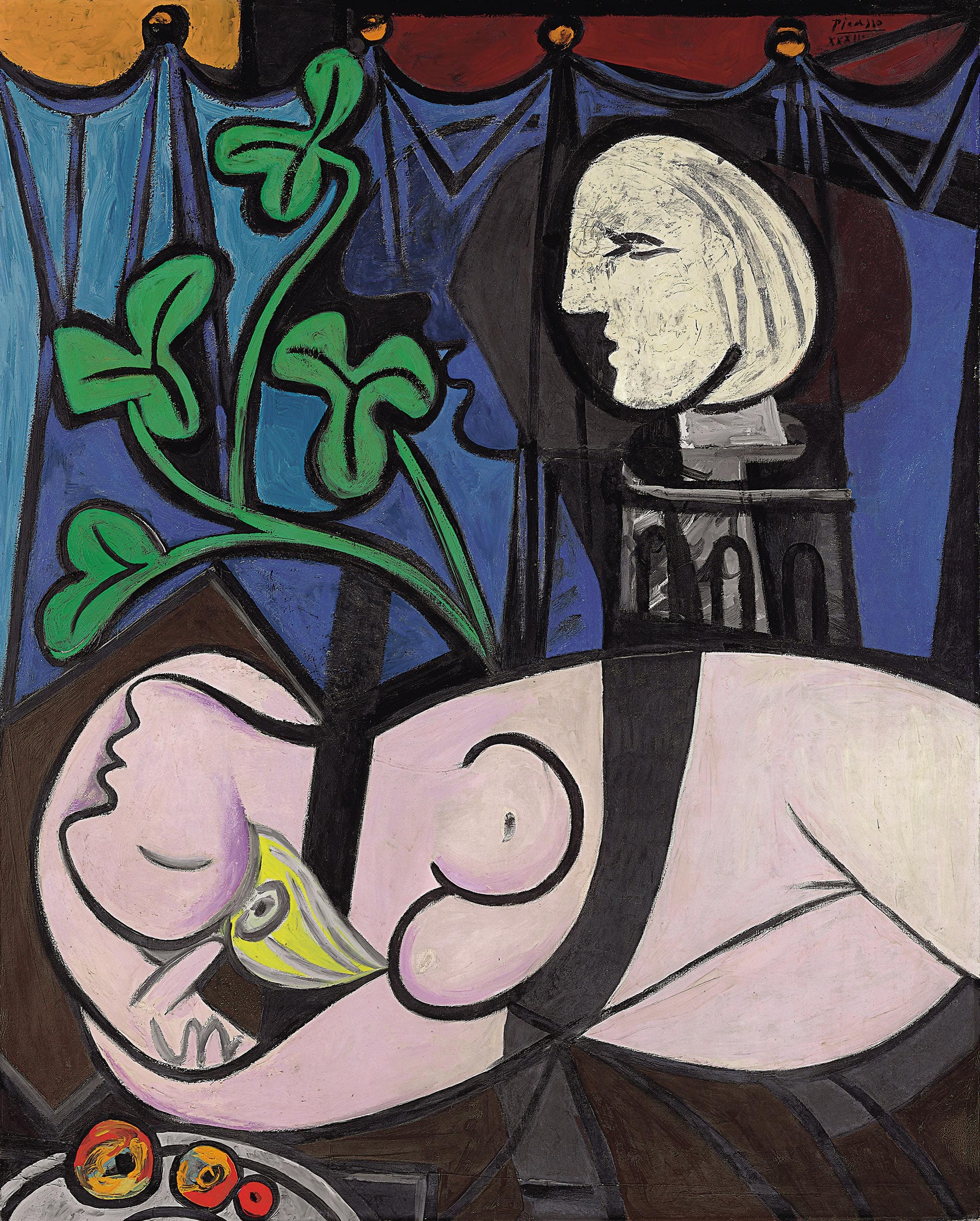
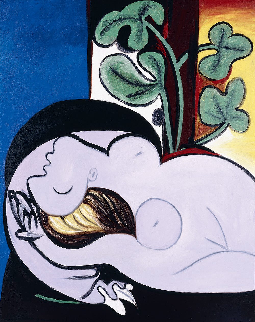
“The day after he painted Nude, Green Leaves and Bust, Picasso picked up his brushes again to create Nude in a Black Armchair [below]. The same reclining figure is again flung across the bottom of the picture but gone is the previous day’s ambivalence. Here, the body is shorter, wider, fuller, richer. The green leaves have a scrotal quality; one stem is thrust right through the wooden stake that supports it.”
Picasso 1932: Love, Fame, Tragedy in Tate Modern, London, until Sep 9th, 2018.

“Most of the time we ignore so much of the world around us. We are sleepwalkers in our own lives, relying upon crib sheets and lecture notes in place of the full spectrum of experience. We walk through the world and don’t pay attention to it. We see without seeing. We quickly classify others as ‘others’ and don’t see them as individuals. We classify new ideas as ‘crazy’ and don’t give them a second thought. We tread the same old paths and don’t look to the left or right. Like the magician’s daughter Miranda in Shakespeare’s play The Tempest, we are prisoners of our own islands of thought until some foreign intruders come to our shores. Then we realize the wonder and perils of interacting with this ‘brave new world’ outside the scope of our former mental models.” — Yoram Wind and Colin Crook in The Power of Impossible Thinking
