Random finds (2019, week 15) — On what’s safe to forget, how ‘good design’ failed us, and wabi-sabi’s aesthetic components

I have gathered a posy of other men’s flowers, and nothing but the thread that binds them is mine own.” — Michel de Montaigne
Random finds is a weekly curation of my tweets and, as such, a reflection of my fluid and boundless curiosity.
If you want to know more about my work and how I help senior executives and leadership teams find their way through complexity and change, please visit my ‘uncluttered’ website.
This week: Maybe we should consider what becomes safe to forget; what would design look like if its aim weren’t profit?; demystifying the beauty of things imperfect; the passion paradox; Urdu and the meaning of language and homecoming; “Aphrodite arose — the Flower of Time”; an award-winning mosque in southwest Sydney; and, finally, our need for an aesthetic view of life.
How much can we afford to forget?
It is common to frame discussions of societal transitions by focusing on the skills that become essential. But instead of looking at what we are learning, maybe we should consider what becomes safe to forget?
“Most of us no longer know how to grow the food we eat or build the homes we live in, after all. We don’t understand animal husbandry, or how to spin wool, or perhaps even how to change the spark plugs in a car. Most of us don’t need to know these things because we are members of what social psychologists call ‘transactive memory networks,’” Gene Tracy writes in How much can we afford to forget, if we train machines to remember?
“We are constantly engaged in ‘memory transactions’ with a community of ‘memory partners,’ through activities such as conversation, reading and writing. As members of these networks, most people no longer need to remember most things. This is not because that knowledge has been entirely forgotten or lost, but because someone or something else retains it. We just need to know whom to talk to, or where to go to look it up. The inherited talent for such cooperative behaviour is a gift from evolution, and it expands our effective memory capacity enormously.
What’s new, however, is that many of our memory partners are now smart machines. But an AI — such as Google search — is a memory partner like no other. It’s more like a memory ‘super-partner,’ immediately responsive, always available. And it gives us access to a large fraction of the entire store of human knowledge.”

“Researchers have identified several pitfalls in the current situation. For one, our ancestors evolved within groups of other humans, a kind of peer-to-peer memory network. Yet information from other people is invariably coloured by various forms of bias and motivated reasoning. […] We have learned to be alive to these flaws in others, and in ourselves. But the presentation of AI algorithms inclines many people to believe that these algorithms are necessarily correct and ‘objective.’ Put simply, this is magical thinking. […]
A second quandary relates to the ease of accessing information. In the realm of the nondigital, the effort required to seek out knowledge from other people, or go to the library, makes it clear to us what knowledge lies in other brains or books, and what lies in our own head. But researchers have found that the sheer agility of the internet’s response can lead to the mistaken belief, encoded in later memories, that the knowledge we sought was part of what we knew all along.
Given our increasingly seamless access to external knowledge, perhaps we are developing an ever-more extended ‘I’ — a latent persona whose inflated self-image involves a blurring of where knowledge resides in our memory network. If so, what happens when brain-computer interfaces and even brain-to-brain interfaces become common, perhaps via neural implants? These technologies are currently under development for use by locked-in patients, stroke victims or those with advanced ALS, or motor neurone disease. But they are likely to become far more common when the technology is perfected — performance enhancers in a competitive world,” Tracy writes.
“A new kind of civilisation seems to be emerging, one rich in machine intelligence, with ubiquitous access points for us to join in nimble artificial memory networks. Even with implants, most of the knowledge we’d access would not reside in our ‘upgraded’ cyborg brains, but remotely — in banks of servers. [Dependency] on a network means taking on new vulnerabilities. The collapse of any of the webs of relations that our wellbeing depends upon, such as food or energy, would be a calamity. Without food we starve, without energy we huddle in the cold. And it is through widespread loss of memory that civilisations are at risk of falling into a looming dark age.
But, even if a machine can be said to think, humans and machines will think differently. We have countervailing strengths, even if machines are often no more objective than we are. By working together in human-AI teams, we can play superior chess and make better medical decisions. […]
[Our] memory can adapt and evolve. Some of that evolution invariably involves forgetting old ways, in order to free up time and space for new skills. Provided that older forms of knowledge are retained somewhere in our network, and can be found when we need them, perhaps they’re not really forgotten. Still, as time goes on, one generation gradually but unquestionably becomes a stranger to the next.”
Has ‘good design’ failed us?
In a recent Cultural Comment, entitled Has “Good Design” Failed Us, Nikil Saval, a contributing writer to The New Yorker, covering cities, architecture, and design, and the author of Cubed: A Secret History of the Workplace, asks an intriguing question: What would design look like if its aim weren’t profit?
Here’s Saval’s unabridged article.
“In 1958, the American radical sociologist C. Wright Mills was invited to address the International Design Conference, in Aspen. The lecture he gave, Man in the Middle: The Designer, criticized a number of its audience members for being willing dupes in the grand illusion that was consumer society. ‘Wants do not originate in some vague realms of the consumer’s personality,’ he said. ‘They are formed by an elaborate apparatus of jingle and fashion, of persuasion and fraud.” In this sublime hoax, Mills argued, the designer was central. He made people ‘ashamed of last year’s model’; he tied ‘self-esteem’ with the purchasing of this year’s model; and he ‘created a panic for status, and hence a panic of self-evaluation’ that could be sated only by the ‘specified commodities’ that he designed. This was what came to be known as ‘retail therapy’ — but Mills suggested that, partly thanks to designers, it had become fundamental to the American economy. The result was a perversion not just of economic life but also of culture. As he put it, ‘The uses of culture are being shaped by men who would turn all objects and qualities, indeed human sensibility itself, into a flow of transient commodities, and these types have now gotten the designer to help them; they have gotten him to turn himself into the ultimate advertising man.’
Whether the conference organizers regretted inviting Mills is not a matter of record — toward the end of his lecture, he softened his attack by suggesting that designers could adopt the intimate, use-value virtues of craftsmen — but I was reminded of his words as I walked around ‘The Value of Good Design,’ a small display of goods currently on show at the Museum of Modern Art. A curious bit of auto-institutional history, as well as a plug for the museum’s wallet-shredding design store, the ‘Good Design’ show looks back at the museum’s attempt to establish canons of taste in postwar America — to play, in other words, the man in the middle between designers and consumers. As in a suburban shopping mall, the center of the exhibit is a whole car: the huggable Fiat 500, one of the most charming symbols of the Italian postwar ‘economic miracle.’ (Unfortunately, there is no contest to win it.) Elsewhere, there is the liquid sheen of Eva Zeisel’s porcelain ware, George Nelson’s exclamatory atomic-age clock, and a Japanese-influenced bamboo-framed chair from Charlotte Perriand. To view these items is to feel immediately the induction of ‘wants’ diagnosed by Mills. This is moma’s second show in a decade about its ‘Good Design’ program, and it makes one wonder about both the meaning of those terms and what they are meant to do.
The original ‘Good Design’ initiative was led by Edgar Kaufmann, Jr., previously the head of MoMa’s industrial-design department, who collaborated with the Merchandise Mart of Chicago, which was then the largest wholesaler of home goods in the country. From 1950 to 1955, Kauffman, Jr., would put on display goods that were selected from the country’s best designers. The U.S., in Kauffman, Jr.,’s view, was going to produce a bounty of consumer products one way or the other; he wanted its shoppers to choose tastefully, and to choose modern. In the current show, the La Chaise lounge [chair], by Ray and Charles Eames, an emblematic object, is elevated on a pedestal in the corner of a room. It looks like something between a ghost and a cloud, although trying out its rubber-foam shell betrays an unexpected solidity, and the whimsical, scalloped-out circle in the center gives it an open mouth, or an eye. Photographs commissioned to showcase the chair, which was well-received but not put into production until 1990, feature children peering through it: a nice reminder of the Eames’ abiding interest in environments for play.
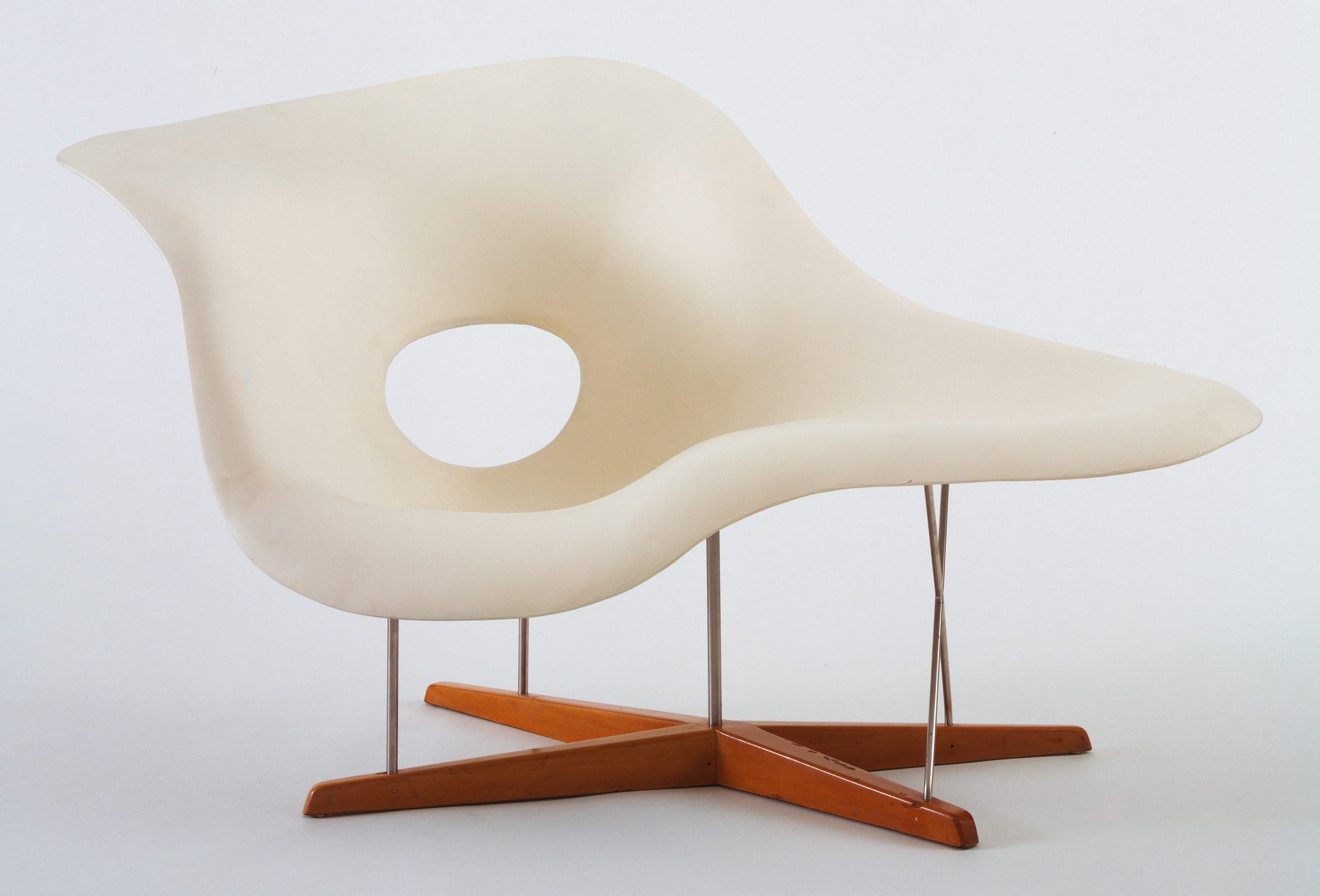
In the past, moma also wanted to show that modern design wasn’t expensive, and they ran a series in the nineteen-thirties and forties advertising ‘Useful Objects’ that began at less than five dollars. A table of more anonymous products bears out Mills’s critique of desires being artificially fostered while simultaneously eliciting immense pleasure in their satisfaction. An outdoor thermometer with a bright display and an ecstatic font marks seventy degrees as ‘ideal’ — a gesture toward the good life that design might provide (as well as a quiet plea to move to California). A display stand for oranges, made up of little mounted and adjoined rings, exudes joyful pointlessness: Who would need to manage their oranges this way, except to revel in the sheer pleasure of their display?
Although the exhibit does not devote much attention to it, many of these objects — and the idea of ‘good design’ itself — emerged from the undertow of war. The inner-tube-like ring of Vinylite that makes up the seat of William H. Miller’s inflatable chair came out of wartime pressures to use new kinds of materials. Miller’s direct contribution to the war effort was to create, with the help of Franklin Delano Roosevelt’s cousin, a portable water desalination device — undoubtedly a product of good design, in the sense of design that could do some good, but we don’t get to see it. A multiscreen display of the landmark Eames film Glimpses of the USA notes that it was part of the American National Exhibition, in Moscow, in 1959, which took place in a geodesic dome designed by [Richard] Buckminster Fuller. At the exhibition, Vice-President RichardNixon famously debated Soviet Premier Nikita Khrushchev inside a model home on the merits of automation in kitchen wares. Khruschev was unmoved by Nixon’s argument, as were several Soviet visitors. ‘I feel sorry for the Americans, judging by your exhibition,’ one wrote in the exhibition guestbook. ‘Does your life really consist only of kitchens?’
Beyond the ‘kitchen debate,’ there was a general question in the ‘good design’ era, among people on every side of the Cold War, as to whether design actually benefited ordinary people — whether there could be any ‘good’ design when its central aim seemed to be to goose people into buying more stuff. The debate in Europe and the U.S. goes back at least to William Morris, the Victorian proponent of the decorative arts and one of the founders of the English Socialist movement, who rued the shoddiness of industrial products, but also the fact that good work, which ought to have the status of art, was increasingly a luxury. Extending this critique, some designers within the modern movement tried to articulate their dissent through the things they produced. The Value of Good Design has a number of starkly beautiful objects from Dieter Rams, the German designer whose renowned work for Braun has become emblematic of non-American ‘gute Form’: cool, understated, low-impact. The pastel coloration, transparency, and minimal decor of his electronics had enormous influence; his products, and his various laconic mission statements on behalf of design, suggested that Cold War consumer societies could still advance a sense of moral clarity.

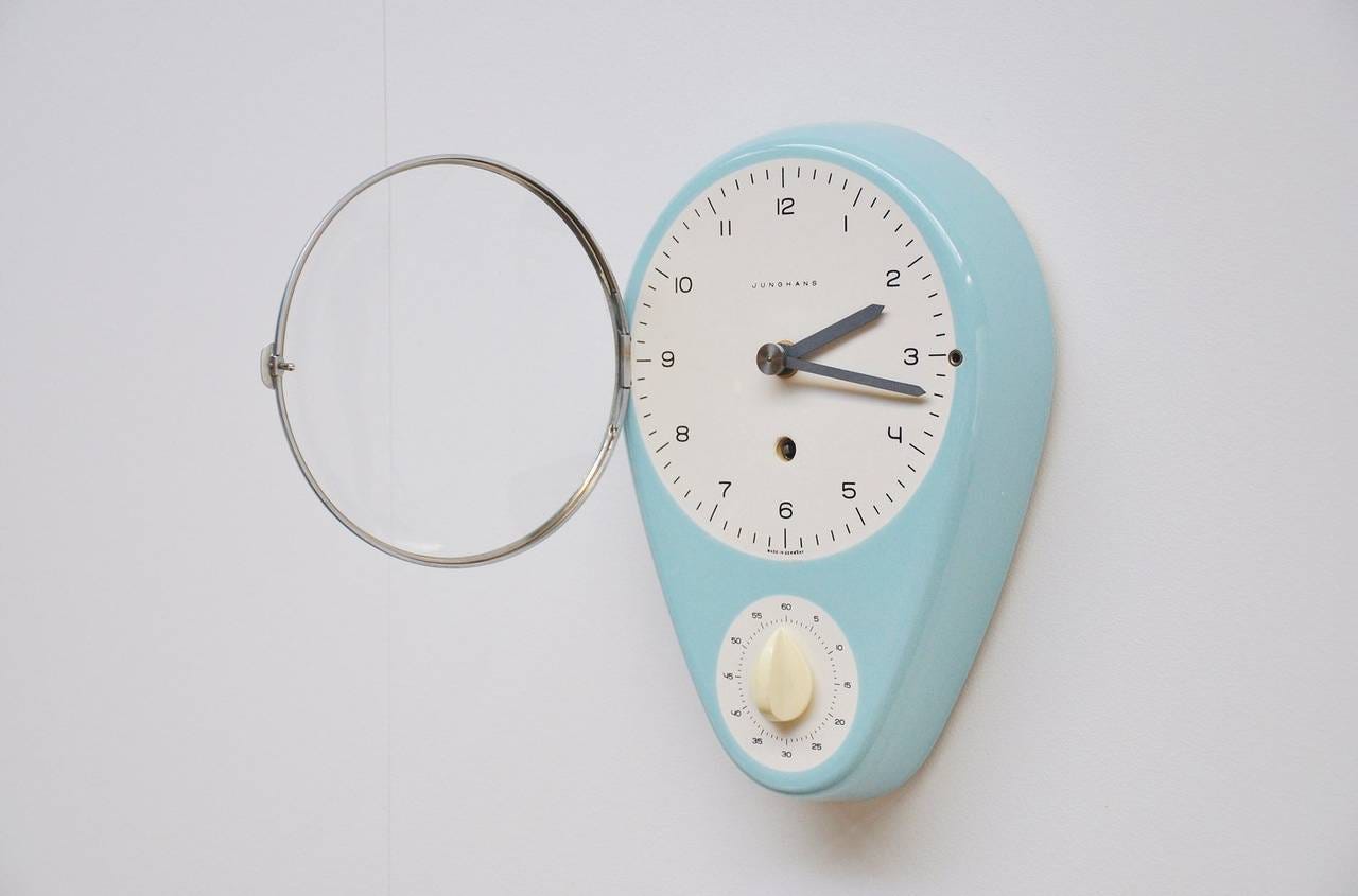
But the dialectic of anti-consumer design took a few more turns of the screw. Max Bill, whose minty kitchen clock hangs alongside the work of Rams, founded a ‘new Bauhaus’ in Ulm, intending, like Rams, to create objects that were durable, quiet, and lasting. The Ulm School of Design was massively influential, but Bill’s work became the subject of an attack by the Danish artist Asger Jorn. Jorn, who was involved in founding the school, saw it finally as another betrayal of the radical Bauhaus, which (at least initially) was about the union of the arts, crafts, and architecture, not product design. Ulm eventually fell apart, partly due to the radicalization of the students against the project that they were ostensibly involved in. They described the consumer society for which they made objects as a form of Kommerzterror, and at one point sought to rename the school Karl Marx College. It closed in 1968. This end to the ‘good design’ narrative isn’t played out in the exhibit. Instead, in the final room of the show, moma asks you to consider Jasper Morrison’s plastic stacking chairs as heirs to good design — a prelude to the moment when, retrieving your coat, you receive a text message saying, ‘Don’t miss our Design Store across 53rd street!’
More than a half-century after Mills delivered his speech, design has become both more pervasive and less responsible. As Alexandra Lange has written about in these pages, Jony Ive, of Apple, a self-proclaimed adept of Rams, lovingly crafts smooth, chamfered edges for his company’s world-conquering products. The aesthetic is precise, alluring — but the objects are designed to meet a suspiciously early obsolescence. Indeed, most of the things that we hold in our hands and stare at, day after day, are examples of ‘good design’ — great design, even, in terms of their inextricability from life. But more and more their social benefit seems questionable. As objects they are meant to be replaced, and they function, as Mills warned, as talismans of our own status.
What would design look like if its aim weren’t profit?
The answer is hidden in the margins of the MoMA show: a device that makes water potable — something you can’t buy at the design store but which might actually save your life.”
The Value of Good Design is an exhibition at the Museum of Modern Art, MoMa, New York (on view through June 15 ) that “explores the democratizing potential of design, beginning with MoMA’s Good Design initiatives from the late 1930s through the 1950s, which championed well-designed, affordable contemporary products.”
Wabi-sabi’s fundamental aesthetic components
In Wabi-Sabi Further Thoughts, Leonard Koren identifies five fundamental aesthetic components of ‘wabi-sabi’ or, as he describes it in his earlier book, Wabi-Sabi for Artists, Designers, Poets & Philosophers, the “beauty of things imperfect, impermanent, and incomplete; a beauty of things modest and humble; a beauty of things unconventional.”
“The focus of my mission became clear: demystify the concept. Translate it into an intelligible form so that all people, irrespective of nationality, could incorporate it into their worldview and aesthetic vocabulary. It seemed likely that taking wabi-sabi out of its native setting might change some of its nuances. Something might get lost. But something might be gained,” Koren writes in Wabi-Sabi Further Thoughts.
“Wabi-sabi is gleaned from ideas articulated during the vital era of wabi-tea. But these ideas, formulated in Japan before the influence of Western philosophy and art theory, lack the lucidity and rigor we expect in our latter-day ‘useful concepts.’ Indeed, wabi-tea is the product of a mindset that eschewed the kind of explicit conceptualization that is the essence of modern aesthetic discourse. Translating a phenomenon that extends from the very tangible to the extremely abstract into a useful concept proved challenging. True, I could have just shown pictures of wabi-sabi-like things with poetic captions. But the goal was more than just an intuitive, non-verbal understanding. The point was to convey a full sense of wabi-sabi as a concept, in words, the medium of explicitly stated ideas.
Through a vigorous negotiation between research results and personal insights into Japanese culture, I attempted to identify the fundamental aesthetic components of wabi-sabi. This comprehension was then distilled into pithy words and phrases. Altogether these words and phrases appeared to provide a sense of wabi-sabi’s essential nature.
Wabi-sabi =
The aesthetic other. The ‘aesthetic other’ offers contrastwith, and differentiation from, the dominant aesthetic convention. It is a bulwark against sameness. At the inception of the wabi-tea era, a Chinese-derived taste for smooth, symmetrical perfection was the most highly appreciated (high-culture) aesthetic sensibility in Japan. Wabi taste, as exemplified by irregular and rough-textured objects, constituted the aesthetic other.
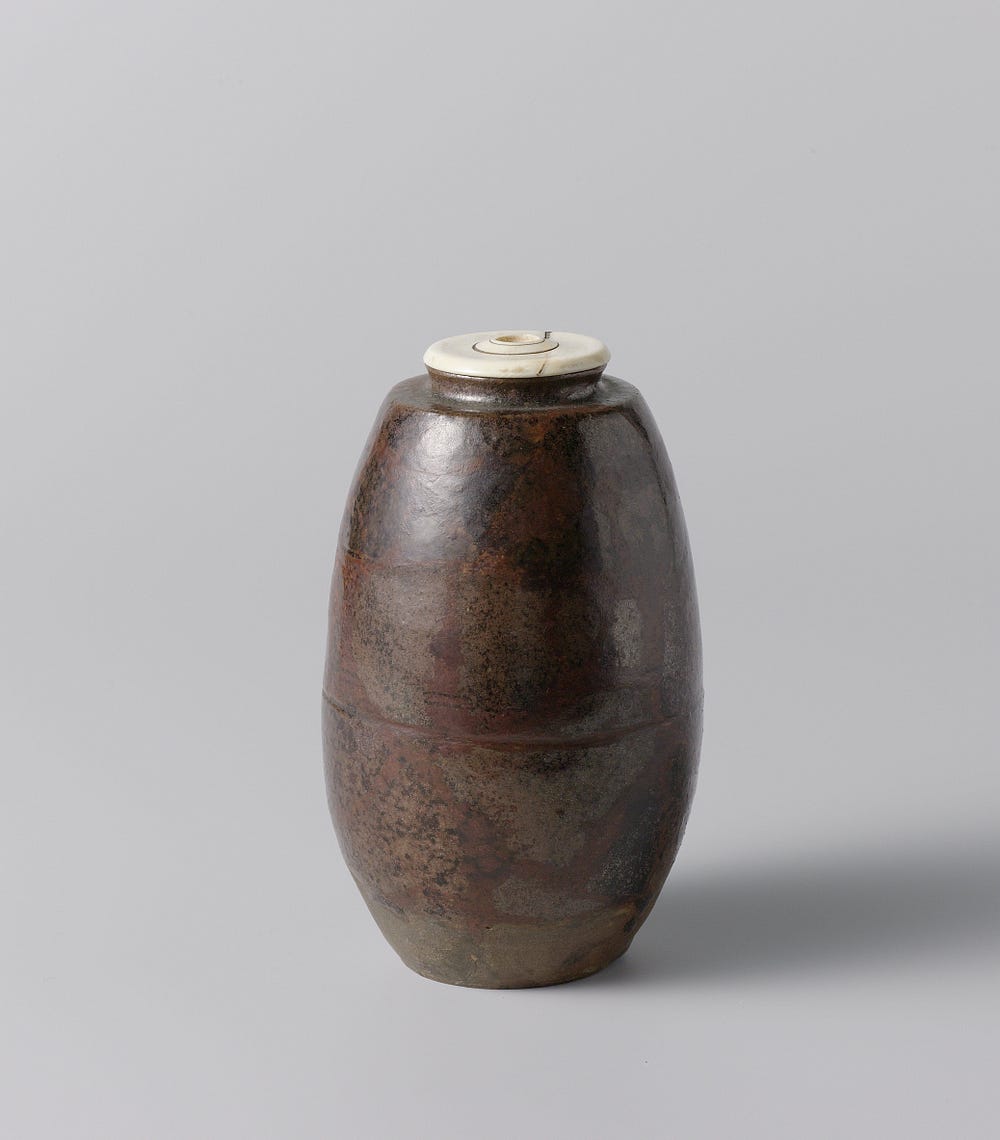
The transfiguration of the commonplace. The beauty of wabi-sabi is a perceptual event; it is not an inherent, property of things. Wabi-sabi ‘happens’ when conditioned and habituated ways of looking at things fall away when things are defamiliarized. The beauty of wabi-sabi involves perceiving something extraordinary in something that might otherwise be regarded as quite ordinary, undistinguished, or barely there. The seminal realization of wabi-tea was that relatively crude, inexpensive, domestic ceramics were actually just as beautiful — albeit in a different way — as any other kind of ceramics.
Beauty at the edge of nothingness. Wabi-sabi emerges out of the infinite potentiality of nothingness. The distinctiveness of wabi-sabi comes from that which is so faint, tentative, delicate, and subtle that it may be overlooked — or mistaken as trivial or insignificant. The task of locating difficult-to-recognize beauty was the enduring pursuit of wabi-tea.
Elegant poverty. ‘Poverty’ in this meaning refers to a mindset of non-attachment, i.e., not holding onto fixed ideas or material things. ‘Elegant’ refers to a grafeful acceptance of restraint, inconvenience, and uncertainty. The embrace of poverty — in a conscious, voluntary, and aesthetic sense — was fundamental to the notion of wabi-tea.
Imperfection. Iconographically, wabi-sabi is often represented by the entry is processes of nature made visible. Entropy precipitates chaos and unpredictability, and this produces variety and interest. ‘Irregularity,’ rather than ‘imperfection,’ is probably a more apt term, but imperfection has more resonance. Imperfection also implies a ‘spiritual condition.’ Under the right circumstances, imperfection-embodied things can amuse a sense of empathy. It was this emphatic bond between objects and beholder that wabi-era tea masters idealized.

Rhetorical considerations. In the overall wabi-sabi concept, each of the aforementioned aesthetic components is intertwined with each of the others. In order to make these interrelationships clearer, the individual components — and their logical corollaries — were deconstructed and reassembled into a single paradigm. This paradigm was configured using widely understood frames of reference. Throughout this intellectual exercise, words, though wonderful tools, revealed the limits of their utility. For example, there is never a direct one-to-one correspondence between physical objects and the correct words to describe them. Words (and ideas) have a different ontological status — that is, belong to a separate category of existence — from that of physical objects. Words can give names to things, but they cannot embody the essence of things; they can only suggest it. To compensate for the limitations of words, especially in describing something almost ineffable, I nudged my prose in the direction of the evocative. The paradigm was meant to grow and expand in the mind of the reader.”
And also this …
Brad Stulberg is the co-author (with Steve Magness) of a new book on the role of passion at the workplace in beyond — specifically, the ways in which it can be a double-edged sword. The Passion Paradox, draws on scientific research and personal stories to illuminate how to discover and cultivate passion, and when passion can have beneficial or harmful outcomes.
When asked in an interview with Jon Jachimowicz for Behavioral Scientist how important it is to pursue your passion?, Stulberg says:
“I think it depends on how you define success. Robert Vallerand has done incredible work there. In his dualistic model of passion, he distinguishes between two types of passion. In harmonious passion, you are pursuing your passion because it reflects what it is that you care about, and as a result, you experience more satisfaction, meaning, and happiness.
And then there’s something called obsessive passion, which is when you’re passionate about something but not because of the pursuit but because of some of the external validation that comes with it. So if your goal is some sort of external success, and you point your passion at that, in the long term it might make you less likely to fulfill that goal. That’s because you get caught up in obsessive passion, which is when the passion transitions from excitement about a particular activity to excitement for some external result. What can happen is, if you don’t see the result that you want, things like burnout, anxiety, depression, and even unethical behavior can creep in.
Another way to think about this is as process versus outcome. When you’re more obsessively passionate, you are more outcome-oriented — that is, your identity gets tied to the outcome you’re pursuing. But if you are harmoniously passionate, then you are more process oriented — that is, your identity gets tied to the process. What’s important here is that I can often control the process more than the outcome. And if my identity is tied more to the outcome than the process — and I can’t control the outcome — then that’s going to cause a lot of distress.”
In Coming Home, One Word At A Time, Sharanya Deepak tells how, upon returning to India, a course in Urdu has helped her embrace the rich and turbulent history of her native country. A delightful story about the meaning of language — “It is not language, it is temperament, and it must be felt” — and homecoming.
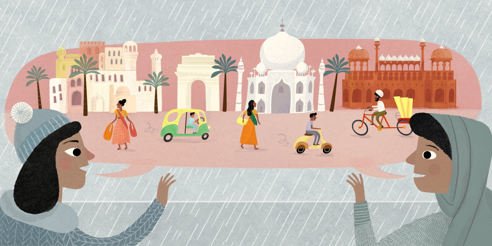
“I grew up in a flurry of languages: in the beautiful, unfurling Tamil of my mother’s rage, in the curt English of my grandfather’s routine, in the effervescent Hindi of my father’s quickly changing moods. The concept of one native tongue had no meaning. Languages switched quickly in our house: New ones entered with meals presented by neighbors, unknown nurturing words appeared in the homes of friends. Our everyday lives were a wonderful linguistic mess, but Urdu — the language that floated in the backdrop of everything in Delhi, in songs, in corners of the old city, in anecdotes told by poetic uncles, in the history of the city’s kings — was the one that got away.
I moved back home more than a year ago. I stopped running from New Delhi, from India, in all its brutality and Technicolor, and I decided to learn Urdu. I had been in Europe for four years, living in old cities, making familiar mistakes with new friends. Dil say toh dilli, I thought, as I flew over the many oceans that lay between new homes and old: ‘No matter where you go, your heart will forever be made of Delhi.’ I was coming home to come to terms with this heart, which had gone from feeling rich and enlightened to feeling broken and weak. Yet the prospect of coming back to relentless New Delhi was still terrifying. If I had to let my heart love the city again — and I had to, of course — it had to be through Urdu.”
“I recently rediscovered my favorite word in Urdu, a word that had resonated with me in my early days of acquaintance with the language: inquilab. Inquilab means revolution, a word used in the center of India’s struggle for freedom from the British, the word painted on the streets when it finally wrung itself free. Premchand, one of the most revered literary voices of the subcontinent, used it in his prose. Premchand wrote both in Hindi and Urdu, but his Urdu works lay buried in the wake of the split.
When I was a little girl, my Uncle Naqvi showed me how to write inquilab, rolling my qafs (the letterforms for Q) into perfect circles, dotting each earnestly, stressing that it was the center of the word that I was writing. Inquilab … Zindabad, he said under his breath as he taught me to write, repeating the Indian slogan for independence from the British, one that he had chanted as a young man.
Inquilab. On the day I learned to write it, I thought we could go back to the way Uncle Naqvi saw Delhi, the subcontinent and Urdu itself: in motion, inclusive, explosive, full of hope, free. Inquilab, I scribbled again and again, for those that lived in the old city, for the charred, robust smells of kebabs and kormas that floated from its kitchens. Inquilab to fight for a country that welcomed intellectualism, inquilab for our poets that still lived in our heads. Inquilab, we wrote, against the wave of spreading Hindu fundamentalism. Inquilab in camaraderie with the women that zoomed past with open windows and open hair. Inquilab for justice in Kashmir. Inquilab for mangoes that sprouted across the subcontinent, bringing everyone temporarily on the same page. Inquilab for the landless, inquilab for those that fought for those with no voice. Inquilab against turmoil, inquilab against unflinching power. Inquilab against the deep, dark depths within myself.
Inquilab, I scratched on my notebook as deep as I would print the names of those whom I loved onto school desks.
Inquilab! And I was home.”
On a golden dawn in the dawn sublime
Of years ere the stars had ceased to sing,
Beautiful out of the sea-deeps cold
Aphrodite arose — the Flower of Time
— From Aphrodite, by Victor Daley
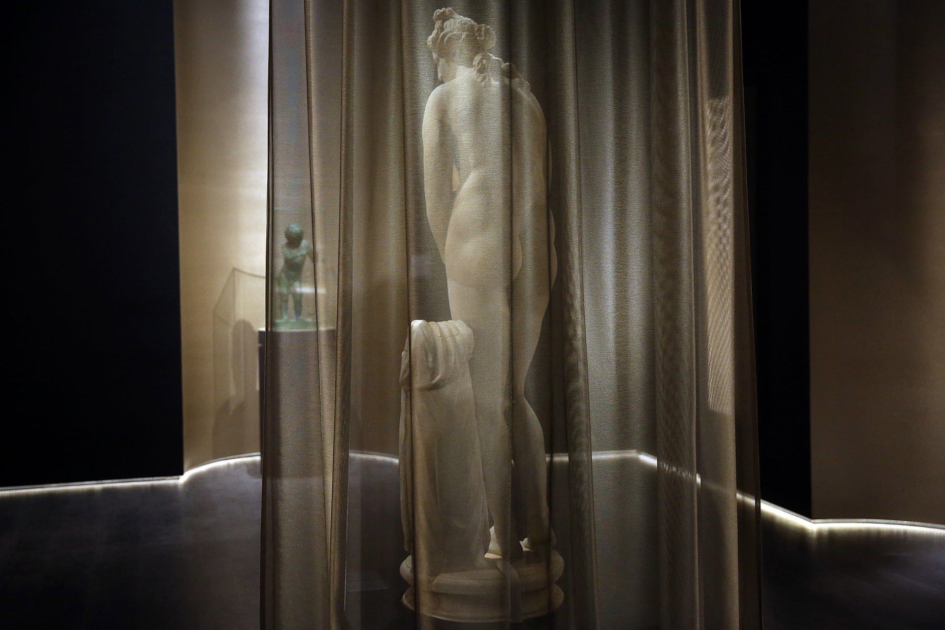
A statue of Aphrodite, the Greek goddess of beauty and love, is displayed for the first time in the National Archaeological museum in Athens. The marble sculpture of Roman origin is part of the temporary exhibition The countless aspects of Beauty and follows a Hellenistic version of the Aphrodite of Knidos by Praxiteles, one of the most renowned sculptors of the 4th century BC and the first to sculpt the nude female form in a life-size statue.
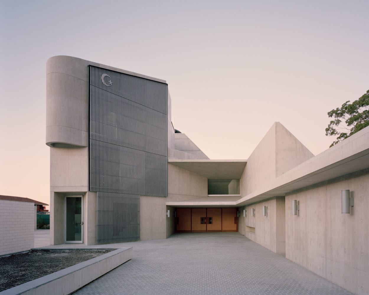
“Punchbowl Mosque is imbued with a sense of the choreography of worship and the needs of its congregation, but in the poetic exploration for that which is essential, it has also uncovered latent potential to transform communities and architectural traditions,” Jason Dibbs writes for arcspace.
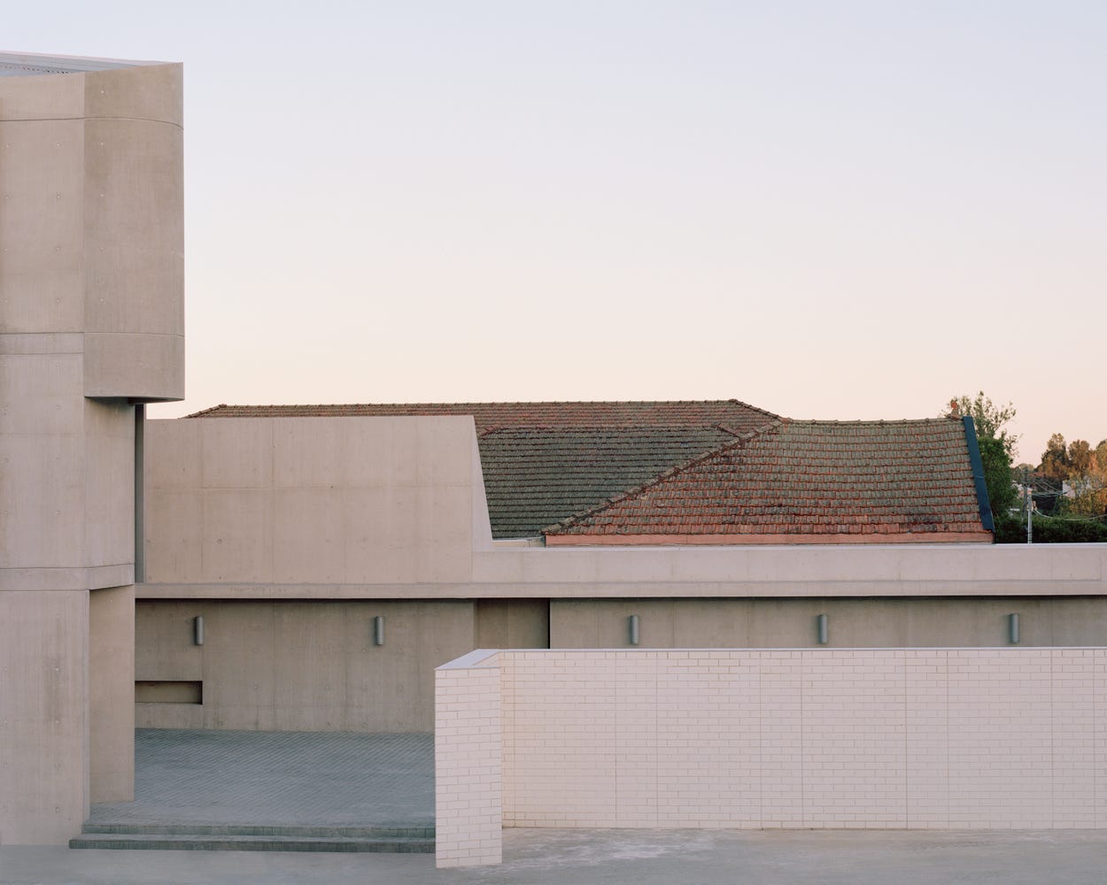
Punchbowl Mosque by the Australian architect firm Candalepas Associates, “is a new religious and community centre woven into the urban fabric of one of southwest Sydney’s most culturally diverse localities. A landmark contribution to Australia’s Islamic community, as well as the local architectural landscape, it negotiates with the conventions of the traditional mosque typology through the geometric interplay of hard and soft edges and a raw and austere sense of materiality. Poetically, Punchbowl Mosque searches for what is essential in sacred architecture and, in the process, redefines our understanding of the Australian mosque.”
Some have likened Punchbowl Mosque to Brutalism, characteristic of public architecture from the 1950s to the 1970s. “However, the only real connection between Candalepas Associates’ mosque and the Brutalist School seems to be the preference for concrete, poured and cast in situ. In fact, Candalepas has been quick to point out that his project was never intended as a reference to Brutalism, nor was it ever intended to be ‘retrogressive’ in its outlook. Indeed, more fruitful comparisons may be drawn between the Punchbowl Mosque and the exquisite concrete detailing found throughout the work of Pritzker Prize recipient Tadao Ando [who recently wrote in The Guardian how Frank Lloyd Wright’s Imperial Hotel has inspired his career]. Similarly, the use of concrete in Candalepas Associates’ mosque is incredibly refined; the juxtaposition of soft curvilinear forms and hard, crisp edges in concrete is both elegant and striking.”
“Tensions between an intimate human scale and the scale of the sublime are evoked by visual datums created by the ascending vertical hierarchy of materials in the prayer hall, and the rhythm and repetition of the 102 Muqarnas domes, seemingly ‘carved’ into the ceiling. The Muqarnas domes each contain a 20 mm diameter oculus, introducing a play of light and shadow. The effect of myriad tiny ‘pin-points’ of light in the cavernous, honeycombed interior kindles associations with constellations and planets, and the historic Islamic astronomers of the middle ages.”


“We could do that by adopting a new aesthetic view of life that places the art world in a larger ecological context. We should also learn, or relearn, to look closely at the aesthetic complexity of nature. This could perhaps create an understanding of art as a co-evolutionary process, a dance, or a process of communication, which evolves in the same way in the human arts, and in other species. Many species of birds learn their songs from other members of their own species. For us humans, Mozart composed music that transformed his listeners’ capacity to imagine what music could be. These new preferences then opened up new opportunities for future composers and listeners. Similarly, the Impressionist painters created new visual preferences that led to the art movements of the twentieth century.
An aesthetic view of life also means elevating beauty to the methodological mainstream, filling some of the blind spots of the present cult of innovation and productivity. It is about seeing the small amongst the big, hearing the quiet in the midst of the loud and appreciating tacit, aesthetic, knowledge in addition to the explicit, rational knowledge that our industrial world is built on.
Our future as a species may, perhaps, be dependent on this.” — Esko Kilpi in An aesthetic view of life
